|
|
Post by 1dave on Feb 25, 2024 15:00:55 GMT -5
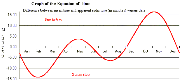
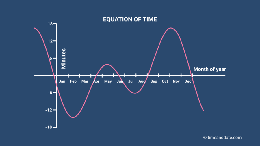
This chart of the sun as it moves across the sky is called an Analemna Chart.  Time measured by the Sun is not the same as time measured by our clocks. The earth travels around the sun in an ellipse, going faster when it is near, and slowest when far away. Clocks measure time exactly, every second exactly like every other second. The Difference is called the Equation of Time. What Does the Equation of Time Look Like?We can plot these dates and times on a graph to give us a visual representation of the equation of time. The dates run horizontally along the x-axis, from January 1 to December 31. The difference, in minutes, between apparent solar time (as measured by the apparent motion of the Sun) and mean solar time (as measured by our clocks) runs vertically along the y-axis. When solar noon comes after 12:00 GMT in Greenwich, the equation of time—shown by the pink line in our graph—shows a negative number of minutes. When solar noon comes before 12:00 GMT in Greenwich, the equation of time is positive. When solar noon comes at precisely 12:00 GMT in Greenwich, the equation of time is zero, and the pink line passes through the horizontal x-axis.  The equation of time, with the pink line showing how many minutes fast or slow the Sun is compared to our clocks and watches. A negative number means the Sun is running slow; a positive number means it is running fast. (This graph is sometimes shown the other way round—the shape of the line is the same, but it’s flipped vertically.)   |
|