|
|
Post by stoner on Jun 18, 2008 1:33:45 GMT -5
Here are some cabs I had finished some time ago and I just got around to taking pics. I finally got around to making a light box, but I'm not sure I like using it. Let me know what you think. The pics with the white background are using the light box. Malachite earring sized cabs. 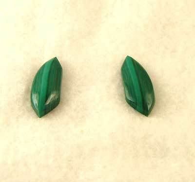 Here's the pendant and the earrings. 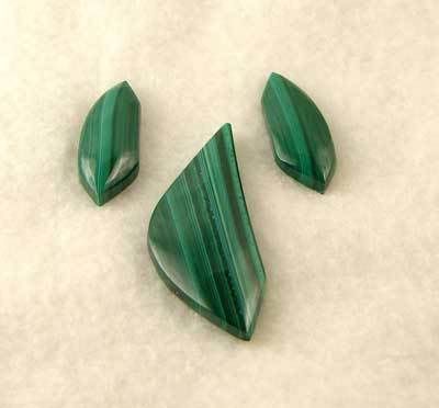 Siberian jade 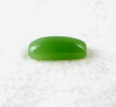 A couple of views of a crazy lace 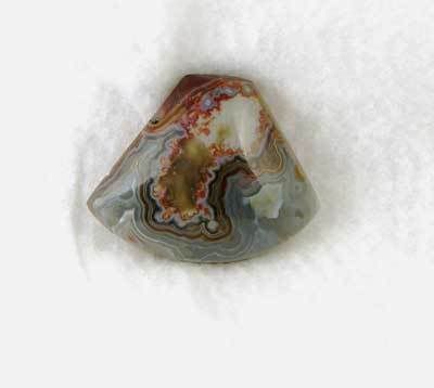 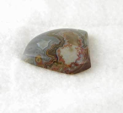 Boulder opal 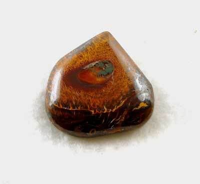 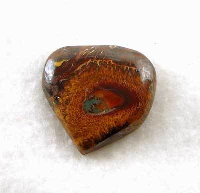 Okay, now the old style photos Confetti Chrysocolla 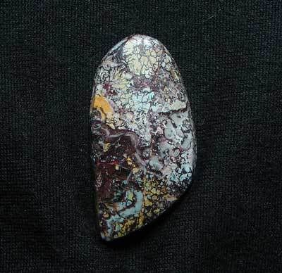 Chrysocolla 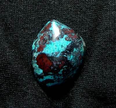 Morgan Hill Poppy-less Jasper ;D 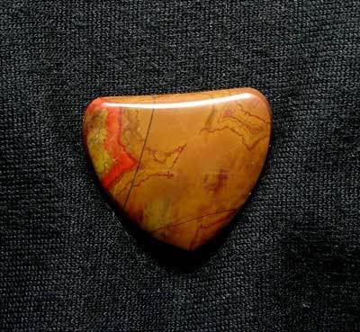 Brazilian agate 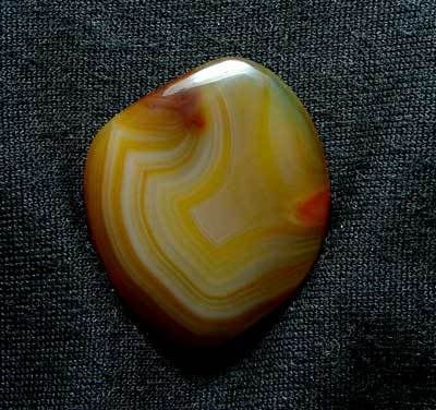 A couple of Labradorite 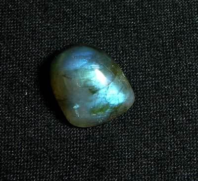 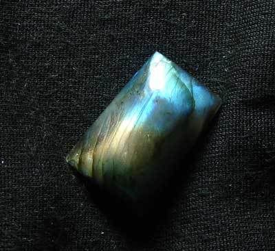 And a rainbow obsidian 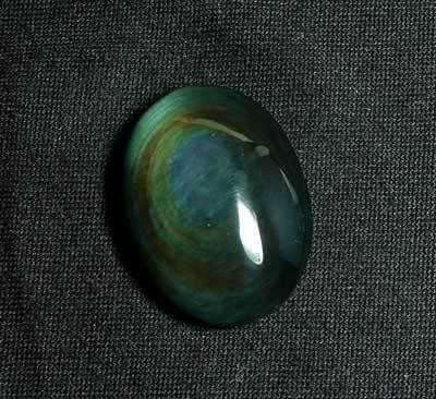 So, which photos do you like best? Old or New? |
|
|
|
Post by Jack ( Yorkshire) on Jun 18, 2008 3:06:33 GMT -5
My Tony you got the Laborite colour realy well
And the Malakite set is great it always looks so good How will you fix the pendant ?
Jack
Yorkshire UK
|
|
|
|
Post by Noosh9057 on Jun 18, 2008 7:06:58 GMT -5
Very nice.
Roger
|
|
|
|
Post by texaswoodie on Jun 18, 2008 7:38:03 GMT -5
Ed, make a little pedestal to put your cab on and bring it away from the background. Makes a tremendous difference.
Curt
|
|
|
|
Post by Tweetiepy on Jun 18, 2008 7:48:54 GMT -5
Well I don't know if it's cuz the rocks in the "old style" are rocks I like better (like the rainbow & the labradorite) but for some reason they stand out more - I wonder if you could get the rainbow to show up in a light box? BUT they're all fantastic - I think the rocks stand out more on the black  |
|
|
|
Post by Tonyterner on Jun 18, 2008 8:19:41 GMT -5
Ed I use a white background for mine but yours seem to look better with the darker background. Weird I know but I'm a complex guy. lol
|
|
|
|
Post by krazydiamond on Jun 18, 2008 8:44:35 GMT -5
that malachite set is killer! i think i like the old style photos the best....
KD
|
|
Sabre52
Cave Dweller  Me and my gal, Rosie
Member since August 2005
Posts: 20,504
|
Post by Sabre52 on Jun 18, 2008 10:04:46 GMT -5
I think I prefer the old photos too. That rainbow obsidian pic shows a great display of color....Mel
|
|
WyckedWyre
fully equipped rock polisher
  
Member since April 2007
Posts: 1,391
|
Post by WyckedWyre on Jun 18, 2008 10:42:48 GMT -5
I like the dark background, Ed, shows off the stones better.
8-)S
|
|
adrian65
Cave Dweller  Arch to golden memories and to great friends.
Member since February 2007
Posts: 10,790
|
Post by adrian65 on Jun 18, 2008 10:46:25 GMT -5
Those cabs could be old, but they're new to me. And they're so beautiful! Especially the malachite set and the rainbow obsidian!
Adrian
PS. I like how the pics in the light box reveal the thickness of the cabs, but in the same time I like the dark background of the old style pics. Maybe you could combine the best from each style to get the best of the best not only in cabbing, but also in picturing them.
|
|
holdemplyer
spending too much on rocks
 
Member since January 2008
Posts: 418
|
Post by holdemplyer on Jun 18, 2008 10:48:14 GMT -5
Ed, i like the older style too. Great work shines through no matter the background though, so as long as it's yours, it'll look great, those malachite are deserving of a very, verrrrrry long whislte!
|
|
|
|
Post by stoner on Jun 18, 2008 20:14:51 GMT -5
Thanks everyone. I tend to agree with you all, I like the black background better too. I'll keep playing with it, this is just rev. 1
|
|
SteveHolmes
fully equipped rock polisher
  
Member since July 2009
Posts: 1,900
|
Post by SteveHolmes on Jun 18, 2008 22:38:29 GMT -5
Like em' Ed! Especially the 1st BO on the white background. Looks like what I picture "HELL" to loook like. "Ring of Fire" no doubt.
Steve
|
|
|
|
Post by Woodyrock on Jun 19, 2008 1:31:56 GMT -5
The older method with the dark background appers to be more sharply focused. That could be the camera's focusing being fooled by the lighter background. Like Curt said, a pedestal would drop the background, and keep the cab sharp.
Woody
|
|
rollingstone
starting to spend too much on rocks
 
Member since July 2009
Posts: 236
|
Post by rollingstone on Jun 19, 2008 3:55:36 GMT -5
The lighting looks more even on the light-box pics, though overall I prefer the old pics -- I think most stones (not all) look best on a black background.
Looks like the old pics use a flash, I wonder if natural lighting would make a difference (you've probably already played with that).
Maybe crop things a bit tighter in the cameral viewfinder -- that way the background is a minor part of the image so has much less of an influence on the camera's auto settings.
Those are minor points though -- the pics look very good as is.
-Don
|
|
textiger
freely admits to licking rocks
  
Member since May 2005
Posts: 946
|
Post by textiger on Jun 19, 2008 10:29:19 GMT -5
Ed, those malachites are awesome!
And, I agree with everyone else about the dark background.
mat
|
|
|
|
Post by Tony W on Jun 19, 2008 13:59:28 GMT -5
Oh, so nice, Ed! They all look great, but.... although the light box spreads the light evenly it doesn't get into the stone and show the "pop". I used two 250 watt shop lights with my light box and had the sides of it smokin', but still couldn't get the pop the sun provides.
I don't know... try a black background and add a sunlamp?
Love the Rainbow!! T
|
|
karenfh
fully equipped rock polisher
  
Member since November 2006
Posts: 1,495
|
Post by karenfh on Jun 19, 2008 19:40:37 GMT -5
So put the black fabric in the lightbox, put the rocks on a pedestal...
I don't care how you do it, your cabs are fantastic! As are your pictures.
|
|
hkswrapsody
starting to spend too much on rocks
 
Member since June 2008
Posts: 109
|
Post by hkswrapsody on Jun 19, 2008 21:51:01 GMT -5
cabs are great but I like the lighter background, the cabs stand out better. Try standing the cabs up? I think the background won't be so obvious and then the cabs may really jump out. In my very inexperienced opinion:)
|
|