|
|
Post by Jack ( Yorkshire) on Oct 12, 2011 3:00:20 GMT -5
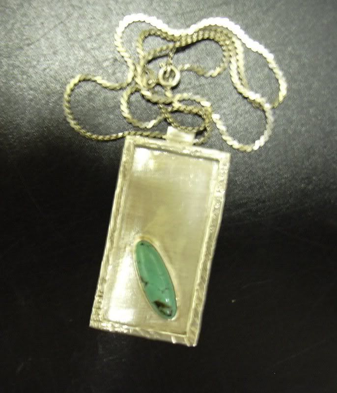
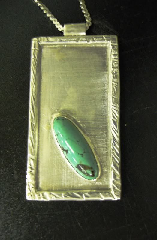
This delightfull pendant was made by one of our students Gillian 1  2 closeup  I especialy like the cross hatched background jack Yorkshire uk |
|
|
|
Post by frane on Oct 12, 2011 8:56:35 GMT -5
Your student has talent! That is beautiful!!!
Fran
|
|
NDK
Cave Dweller 
Member since January 2009
Posts: 9,440
|
Post by NDK on Oct 12, 2011 19:41:35 GMT -5
That's really cool. I like the offset stone.
Nate
|
|
|
|
Post by connrock on Oct 13, 2011 14:02:55 GMT -5
VERY nice Jack,,,
Guess Gillian had a good teacher!
connrock
|
|
|
|
Post by Jack ( Yorkshire) on Oct 16, 2011 10:29:07 GMT -5
Hi Fran , Nate , and Tom,
many thanks for the comments
Yes Rebecca is a good teacher
jack
Yorkshire uk
|
|
|
|
Post by Toad on Oct 16, 2011 15:28:10 GMT -5
Love it. The plain-ish backgound sets the stone off nicely. The border frames the whole piece nicely.
|
|
|
|
Post by kk on Oct 16, 2011 17:29:43 GMT -5
Really nice refreshing idea. As said before, it shows the stone off really well. Being a teacher and seing tangible results must be very rewarding.  |
|
steelandstone
has rocks in the head
  
Member since September 2008
Posts: 500
|
Post by steelandstone on Oct 21, 2011 20:53:00 GMT -5
Nice pendant. I like the stone placement and the textures came out great.
|
|
skystone
starting to spend too much on rocks
 
Member since April 2011
Posts: 171
|
Post by skystone on Oct 21, 2011 22:45:48 GMT -5
Goes to show the old saying "less is more". People don't grasp the effect of "negative" (blank) space & always want to fill it up. A very nice example of simple design & execution.
Mike
|
|