|
|
Post by stardiamond on Apr 10, 2019 17:28:32 GMT -5
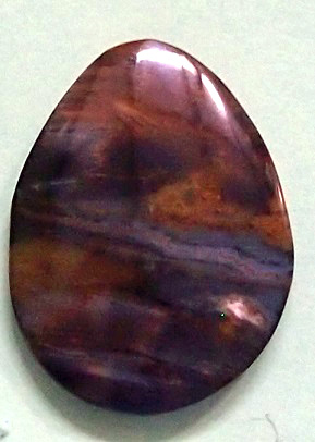
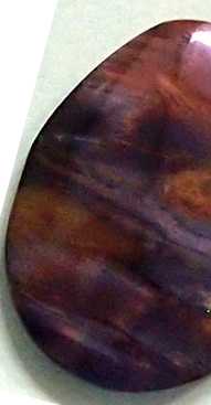
Piece has good chatoyancy, but the white area appeared as it was being ground. It detracts from the appearance. I would use a c curve on the right edge. The symmetry on the existing cab is also off.   |
|
|
|
Post by Pat on Apr 10, 2019 19:23:00 GMT -5
I like the white area.
|
|
mgrets
spending too much on rocks
 
Member since February 2011
Posts: 321
|
Post by mgrets on Apr 10, 2019 21:23:20 GMT -5
I would just refine the existing shape a bit and leave the white spot. Like Pat, I think the contrast adds to the cab.
|
|
Deleted
Deleted Member
Member since January 1970
Posts: 0
|
Post by Deleted on Apr 10, 2019 22:09:46 GMT -5
I like it, too. It sort of reminds me of a dark storm where you get a spot of light making its way through the clouds.
|
|
jasperfanatic
spending too much on rocks
 
Member since January 2019
Posts: 463
|
Post by jasperfanatic on Apr 10, 2019 22:38:48 GMT -5
I'm a fan of the white spot as well.
|
|
|
|
Post by hummingbirdstones on Apr 10, 2019 23:17:15 GMT -5
Yup, refine and leave the white spot. I like it.
|
|
|
|
Post by greig on Apr 11, 2019 13:44:07 GMT -5
I would be happy with it as-is. At the end of the day, (only) you have to be happy with it. I would suggest putting it to one side for a while and take another look later. If you decide to rework it, there is always the danger of making it worse, but there is also the additional lesson you will learn. I sometimes play with rocks until they are completely destroyed, but I tell myself that it was a cheap education. ;-)
|
|
|
|
Post by rockjunquie on Apr 12, 2019 10:46:08 GMT -5
|
|