Welcome to the Rock Tumbling Hobby Forum where we share a love of rocks and a sense of community as enduring as the stones we polish.
The RTH Forum of www.RockTumbling.com is an Amazon Associate site and we earn money from
qualifying purchases you make after clicking on our links such as this
Rock Tumbling Supplies on Amazon
link for instance, or any of our various product ads and banners. By clicking our links every time you begin your Amazon shopping
experience, you are generating a bit of revenue for the forum which helps us cover our expenses. Thank you for your support!
If you cannot see Amazon ad banners directly below this text, please whitelist this site in your ad blocker(s). The ads below have been hand-selected for relevant content, and your patronage directly benefits this forum community, thanks!
Post by Bhikkhu Pesala » Thu Feb 21, 2008 2:43 am There is no need to add an ogonek to the long-tailed g, it only needs to be added to vowels. Adding accents to script fonts is quite a challenge. Almost every letter is a special case.
It helps a lot to add low profile accents to the font. Then you can have different accent designs for lowercase and uppercase. Complete Composites will use the low profile accents for uppercase and the regular accents for lowercase. Autopositioning is difficult for scripts too. Complete Composites will use autopositioning to centre accents on the base glyph with an offset for acute/grave and italics, but the optical centre is not always the same as the geometric centre, especially with script fonts.
Other glyphs, like æ or Þ need some creativity if they are going to match the font properly. Although you may never need more than a few accents, many users in Europe do require them for their daily work. Fonts without accents are next to useless for them.
Here is a very rough attempt. I haven't made much effort to design the accents to match the font, they are more suited to Garava italic than to Yolanda. The low profile accents should be designed to suit uppercase glyphs, then moved down to the same vertical position as the lowercase accents. Setting the advance width to zero and using a Capital A or E in the Comparison toolbar helps a lot with the design process.
Attachments
Yolanda2.zip (23.15 KiB) Downloaded 216 times
My Fonts • Reviews: MainType • Font Creator • Help • FC13 Pro + MT10.0 @ Win10 2004 build 19041.804
This space is for temporary chat only and all posts drop off automatically and are not saved.
Members with real questions or comments that need an actual response, please post on the main forum - not here! Casual PG-13 posts only, no politics or religion please!
ThomasT: Summertime is coming... buoys and ladles get ready for Solstice
Jun 12, 2024 15:02:49 GMT -5
Son Of Beach: Why is change hard? It is a strange thing...
Jun 13, 2024 20:10:02 GMT -5
wargrafix: Change is hard. After all, its made up of coins.
Jun 14, 2024 7:21:04 GMT -5
ThomasT: Change can be counted on...
Jun 14, 2024 9:30:16 GMT -5
Wooferhound: The only thing that is permanent is Change
Jun 14, 2024 14:41:49 GMT -5
ranchorosa: I found Quartz just east of Dryden, TX. and it does not seem to be a common find. I looked online and it seems like quartz is only typically found near Llano and further west in Alpine, TX..... could this be a sign of possible bigger finds in the area?
Jun 15, 2024 18:07:17 GMT -5
RickB: Have a quartzy day
Jun 16, 2024 9:30:29 GMT -5
*
Welcome to the Rock Tumbling Hobby Forum where we share a love of rocks and a sense of community as enduring as the stones we polish.
The RTH Forum of www.RockTumbling.com is an Amazon Associate site and we earn money from
qualifying purchases you make after clicking on our links such as this
Rock Tumbling Supplies on Amazon
link for instance, or any of our various product ads and banners. By clicking our links every time you begin your Amazon shopping
experience, you are generating a bit of revenue for the forum which helps us cover our expenses. Thank you for your support!


 Adding accents to script fonts is quite a challenge. Almost every letter is a special case.
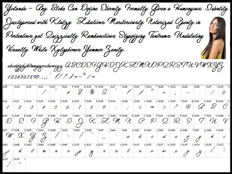


 Have a quartzy day

