|
|
Post by miket on Oct 12, 2021 14:52:59 GMT -5
|
|
|
|
Post by MsAli on Oct 12, 2021 15:15:59 GMT -5
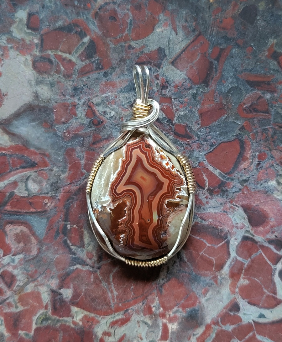
IMO it is too busy and distracts from the cab
|
|
brotherbill
spending too much on rocks
 
Member since October 2018
Posts: 388
|
Post by brotherbill on Oct 12, 2021 15:32:59 GMT -5
That cab/wrap combo is really killer!
That background rock would be in queue to be cabbed as well.
|
|
|
|
Post by miket on Oct 12, 2021 15:38:54 GMT -5
IMO it is too busy and distracts from the cab Thanks |
|
|
|
Post by miket on Oct 12, 2021 15:41:36 GMT -5
That cab/wrap combo is really killer! That background rock would be in queue to be cabbed as well. Thank you, sir!
Oh, it is, eventually. I don't have the slab in front of me at the moment but I'm guessing it's at least 6" x 9". |
|
|
|
Post by hummingbirdstones on Oct 12, 2021 20:28:26 GMT -5
I have to agree with Ali, miket. It would look better on a single color background. |
|
|
|
Post by miket on Oct 12, 2021 20:38:16 GMT -5
I have to agree with Ali, miket . It would look better on a single color background. Thanks Robin. Still experimenting... |
|
|
|
Post by rockjunquie on Oct 12, 2021 20:43:40 GMT -5
I think because there is no contrast, the cab just gets lost in the background. Maybe a lighter slab?
|
|
|
|
Post by jasoninsd on Oct 12, 2021 20:48:17 GMT -5
Hmmm...I actually kind of like it on that background. Nothing like going against the masses! LOL  |
|
quartz
Cave Dweller  breakin' rocks in the hot sun
Member since February 2010
Posts: 3,359
|
Post by quartz on Oct 12, 2021 23:22:02 GMT -5
I'll second Jason, subject stone and background are very similar but the wrapping really sets off the subject.
|
|
pizzano
Cave Dweller 
Member since February 2018
Posts: 1,390
|
Post by pizzano on Oct 13, 2021 0:50:16 GMT -5
I can focus on three elements to the composition of this exhibit.......an interesting stone background of similar mosaic texture to a center piece stone, a very nice semi braided sliver wrapping surrounding a center piece stone and the center piece handcrafted stone.
The question this viewer has.....which of these elements strikes my attention first and foremost.......?
That is also the question the photographer must answer within his (her) own target of attention desired.....composition....!
My focus of attention with this combination of color, contrast and matrix patterns, displayed together, is the sliver semi braided wrapping. It's the only object there that is not fighting for attention.
Mike, very good camera and lighting work......little to no glare or reflection (streaks) and every thing is within good balanced focus depth.
|
|
|
|
Post by miket on Oct 13, 2021 9:17:30 GMT -5
I think because there is no contrast, the cab just gets lost in the background. Maybe a lighter slab? Thank you, ma'am. Still trying to decide...I'd like to keep the background constant with all of the pieces. And then I thought to myself, but what about when I decide to cut up the slab?  |
|
|
|
Post by miket on Oct 13, 2021 9:18:02 GMT -5
Hmmm...I actually kind of like it on that background. Nothing like going against the masses! LOL Thanks my friend. And you, going against the masses? |
|
|
|
Post by miket on Oct 13, 2021 9:18:32 GMT -5
I'll second Jason, subject stone and background are very similar but the wrapping really sets off the subject. Thank you! |
|
|
|
Post by miket on Oct 13, 2021 9:23:30 GMT -5
I can focus on three elements to the composition of this exhibit.......an interesting stone background of similar mosaic texture to a center piece stone, a very nice semi braided sliver wrapping surrounding a center piece stone and the center piece handcrafted stone. The question this viewer has.....which of these elements strikes my attention first and foremost.......? That is also the question the photographer must answer within his (her) own target of attention desired.....composition....! My focus of attention with this combination of color, contrast and matrix patterns, displayed together, is the sliver semi braided wrapping. It's the only object there that is not fighting for attention. Mike, very good camera and lighting work......little to no glare or reflection (streaks) and every thing is within good balanced focus depth. Thank you, sir, for your input.
Although I'm doing this to display them on my site for the purpose of selling a pendant, my main focus is the stone. Which is probably the wrong way to look at it- but maybe potential buyers would be more drawn to the stones than the wraps...who knows?
I appreciate the compliment on the picture- it was actually taken inside by a window on a cloudy day. Maybe that's the ticket to getting more "true" colors for what I'm doing.
|
|
|
|
Post by opalpyrexia on Oct 13, 2021 10:59:22 GMT -5
Terrific pendant, Mike!
I agree with the advice that you're getting. I recommend looking for something neutral with very little or no color and lacking high contrast patterns.
|
|
|
|
Post by miket on Oct 13, 2021 11:06:01 GMT -5
Terrific pendant, Mike! I agree with the advice that you're getting. I recommend looking for something neutral with very little or no color and lacking high contrast patterns. Thanks, Gary!
White and black backgrounds don't seem to really do it for me, so I guess I'll keep experimenting...
|
|
|
|
Post by knave on Oct 13, 2021 11:38:42 GMT -5
Terrific pendant, Mike! I agree with the advice that you're getting. I recommend looking for something neutral with very little or no color and lacking high contrast patterns. Thanks, Gary!
White and black backgrounds don't seem to really do it for me, so I guess I'll keep experimenting...
I keep think of the portrait mode photos that iPhone does. I think that background would be great if it could somehow be a bit more muted, blurred or frosted in some way |
|
|
|
Post by knave on Oct 13, 2021 11:45:22 GMT -5
 VS ORIGINAL  |
|
|
|
Post by knave on Oct 13, 2021 11:48:49 GMT -5
|
|